15:00
Week 04: Quantitative Analysis III & IV
Descriptive Statistics, Probability, Hypothesis Testing, and Regression
SSPS4403 Research Methods
The University of Sydney
Semester 2, 2026
Welcome Back
Acknowledgement of Country
I would like to acknowledge the Traditional Owners of Australia and recognise their continuing connection to land, water and culture. The University of Sydney is located on the land of the Gadigal people of the Eora Nation. I pay my respects to their Elders, past and present.
Required Reading
Textbook: Kellstedt et al. (2022)
This week’s chapters:
- Chapter 7: Getting to Know Your Data
- Chapter 8: Probability and Statistical Inference
- Chapter 9: Bivariate Hypothesis Testing
- Chapter 10: Two-Variable Regression Models
Today’s Journey
Chapters 7-10: From Description to Inference
- Descriptive statistics and visualization
- Probability and statistical inference
- Bivariate hypothesis testing
- Two-variable regression models
- Applying it all in JASP
Learning Objectives
By the end of today, you will be able to:
- Generate and interpret descriptive statistics in JASP
- Understand confidence intervals and p-values
- Conduct bivariate hypothesis tests (t-tests, chi-square, correlation)
- Run and interpret simple regression models
- Connect statistical outputs to causal questions
Recap: The Four Causal Hurdles
Remember from Week 03:
- Credible mechanism connecting X to Y?
- Reverse causation ruled out?
- Covariation between X and Y?
- Confounders controlled?
Today focuses on Hurdle 3: Testing for covariation!
Today’s Datasets
For demonstrations (instructor-led):
- GSS 2014 - Religion: Religious affiliation in the US (n=2,521)
- African American Homeownership: Percentage of homeownership 1985-2014 (n=19)
- GSS 2014 - Education & Politics: Education, race, party affiliation, union membership (n=602)
- Government Assistance: State-level support for assistance vs. unemployment (n=21)
For hands-on activities (your turn!):
- V-Dem v16: Democracy indicators for countries over time
- File:
V-Dem-v16-12variables.csv - Codebook:
V-Dem-v16-12variables-codebook.pdf
All data files available on Canvas (Week 4 module)
Dataset Details
Demo Datasets (Small)
GSS 2014 - Religion - Variables: RELIG, Religion_Label - Use: Categorical descriptives
African American Homeownership - Variables: Year, Pct_Own_Home - Use: Continuous descriptives, CIs
GSS 2014 - Education & Politics - Variables: EDUC, Race, Party_Label, Union_Label - Use: t-test, chi-square
Government Assistance - Variables: GovtAsst (%), Unempl (%) - Use: Correlation, regression
V-Dem Dataset (Hands-On)
Key Variables: - v2x_polyarchy: Electoral democracy (0-1) - v2x_gender: Women’s empowerment (0-1) - v2x_freexp: Freedom of expression (0-1) - v2mecenefi: Internet censorship (0-4) - e_gdp: GDP per capita - e_regionpol_6C: World region (1-6) - v2exhoshog: Presidential (1) vs. Parliamentary (0)
Always refer to codebook for details!
Descriptive Statistics
Why Describe First?
Golden Rule
Always describe your data before testing relationships!
Descriptive statistics help you:
- Understand typical values and variation
- Identify outliers and data quality issues
- Know your variables before hypothesizing
- Communicate what’s in your sample
Measures of Central Tendency
What’s “typical” for this variable?
Mean
- Average value
- Sum ÷ count
- Best for: continuous variables without outliers
Median
- Middle value when sorted
- 50th percentile
- Best for: skewed data, ordinal variables
Mode
- Most frequent value
- Best for: categorical variables
Measures of Dispersion
How spread out are the values?
- Variance (s²): Average squared deviation from mean
- Standard Deviation (SD): Square root of variance
- In same units as variable
- Roughly: average distance from mean
- Interquartile Range (IQR): Range of middle 50%
- 75th percentile - 25th percentile
- Robust to outliers
Understanding Standard Deviation
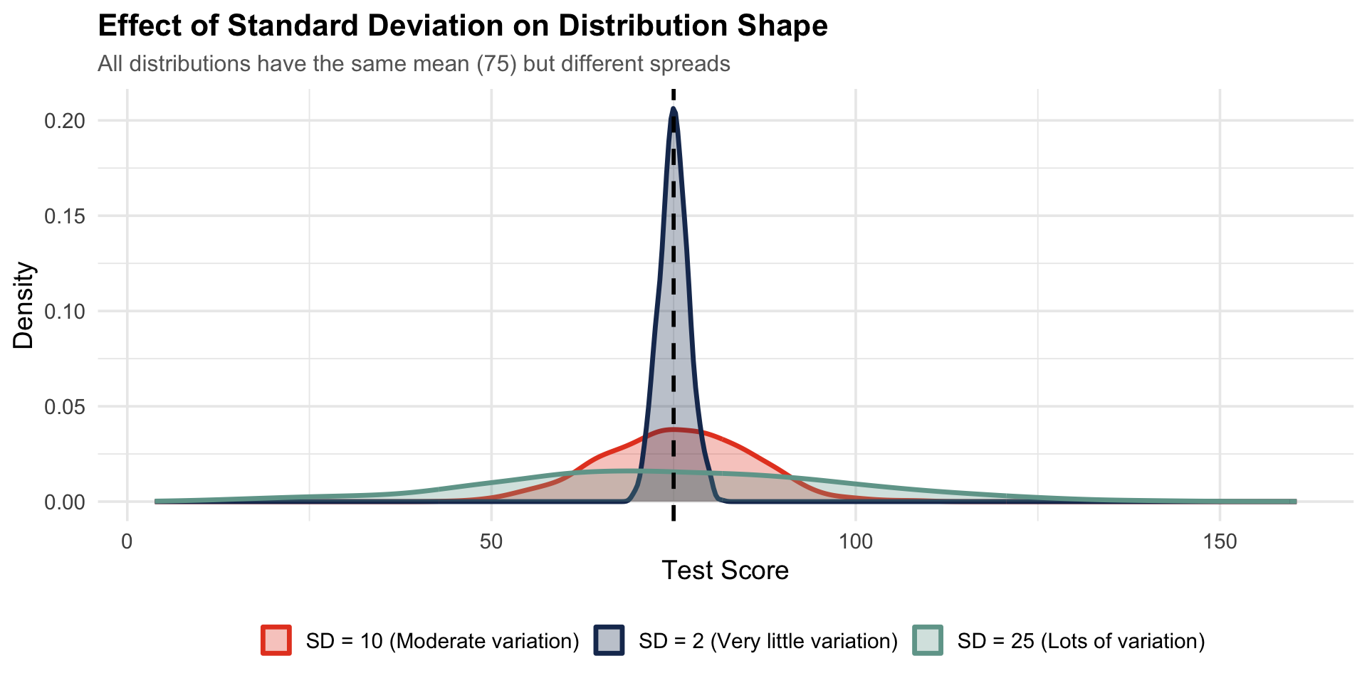
Example: Test scores with mean = 75, SD = 10
- About 68% of scores fall between 65-85 (±1 SD)
- About 95% fall between 55-95 (±2 SD)
- SD = 2 → Very little variation
- SD = 25 → Lots of variation
Tip
SD tells you how “typical” the mean is!
Visualizing Distributions
For Continuous Variables
- Histograms: Show frequency distribution
- Box plots: Show median, quartiles, outliers
- Density plots: Smoothed distribution curve
For Categorical Variables
- Bar graphs: Show frequency of categories
- Pie charts: Show proportions (use sparingly!)
Identifying Outliers
Outliers = extreme values that don’t fit the pattern
- Why care? May indicate:
- Data entry errors
- Measurement problems
- Genuine extreme cases
- Different population
- How to spot:
- Box plots (beyond whiskers)
- Values > 1.5 × IQR from quartiles
- Visual inspection of distributions
Live JASP Demo
Example 1: Categorical Variable - Religion
Dataset: gss2014_religion.csv
Steps in JASP:
- Open file → Descriptives → Descriptive Statistics → Tables and ✓ Frequency Tables
- Move
Religion_Labelto Variables - Check: Display frequency tables
- Basic Plots and ✓ Distribution plots
- Interpret: Which religion is most common? (Mode)
Live JASP Demo
Example 2: Continuous Variable - Homeownership
Dataset: african_american_homeownership.csv
Steps in JASP:
- Open file → Descriptive → Descriptive Statistics
- Move
Pct_Own_Hometo Variables - Check: Mean, Median, SD, Variance, Range, Minimum, Maximum (select under Dispersion)
- Basic Plots → Distribution plots (a.k.a. histogram)
- Customizable Plots → Boxplots
- Interpret:
- What’s the homeownership rate in a typical year? (Mean ≈ 43.5%)
- How much variation? (SD ≈ 4.8%)
- Any outliers?
Hands-On Activity
Describing Your Data
Dataset: V-Dem-v16-12variables.csv (refer to codebook)
In pairs:
- Pick 3-4 variables from V-Dem dataset
- For continuous variables (v2x_polyarchy, v2x_gender, e_gdp): descriptives + distribution plots
- For categorical variables (e_regionpol_6C, v2exhoshog): frequency tables + categorical plots
- Discuss findings
Suggested variables: v2x_polyarchy, v2x_gender, e_gdp, e_regionpol_6C
- Refer to the codebook for the variable description.
Probability & Inference
The Fundamental Problem
The Challenge
We want to learn about populations, but we only have samples
Population
- All Australian adults
- All university students
- Parameters (μ, σ)
- Unknown!
Sample
- 1,000 survey respondents
- 500 students
- Statistics (ȳ, s)
- Known!
From Sample to Population
The logic of inference:
- Take a random sample from population
- Calculate sample statistic (e.g., mean ȳ)
- Use it to estimate population parameter (μ)
- Quantify our uncertainty with confidence intervals
Note
This only works with random sampling!
Sampling Distributions
Key insight: If we took many samples…
- Each sample would have a slightly different mean
- Those sample means form a distribution
- This is the sampling distribution of the mean
- It follows a normal distribution (Central Limit Theorem!)
- Its spread is the standard error
Standard Error
Standard Error (SE): Uncertainty in our sample estimate
SE = \frac{SD}{\sqrt{n}}
- Smaller SE → More precise estimate
- Larger sample (n) → Smaller SE
- More variable data (SD) → Larger SE
Interpretation: How much sample means vary due to chance
Confidence Intervals
95% Confidence Interval:
\bar{y} \pm 1.96 \times SE
- “We are 95% confident the true population mean falls in this range”
- Not: “95% probability the mean is in this range”
- If we repeated sampling 100 times, ~95 CIs would contain true mean
Tip
Wider CI = More uncertainty; Narrower CI = More precision
Example: Presidential Approval
Sample: 900 respondents, 46% approve
- Point estimate: 46%
- Standard error: ≈ 1.7%
- 95% CI: 46% ± 3.4% → [42.6%, 49.4%]
- Interpretation: We’re 95% confident true approval is between 42.6% and 49.4%
Interactive JASP Demo
Computing Confidence Intervals
Dataset: african_american_homeownership.csv
Steps in JASP:
- Descriptive → Descriptive Statistics
- Move
Pct_Own_Hometo Variables - Statistics: Check “Mean” (under “Central tendency”) and “Confidence interval for the arithmetic mean” (under “Dispersion”)
- Plot: Select “Interval plots” in “Basic Plots”
- Observe output
Interpretation practice:
- Mean homeownership ≈ 43.5%
- 95% CI ≈ [41.2%, 45.8%]
- We’re 95% confident true population mean falls in this range
- Narrow interval (n=19 is small, but low variability)
Hypothesis Testing
The Logic of Hypothesis Testing
Research question: Is X related to Y?
- Null hypothesis (H₀): No relationship (X and Y unrelated)
- Alternative hypothesis (H₁): There IS a relationship
- Collect data and calculate test statistic
- P-value: Probability of observing this result if H₀ is true
- If p < 0.05: Reject H₀, conclude relationship exists
Understanding P-Values
P-value = Probability of our data (or more extreme) if null hypothesis is true
- p < 0.05: “Statistically significant” (conventional threshold)
- p = 0.03: Only 3% chance of observing these results if no real relationship
- p = 0.40: 40% chance - quite possible under null hypothesis
Critical Distinction
p-value ≠ strength of relationship!
Small p-value → Evidence relationship exists
Effect size → How strong/meaningful the relationship is
Significance vs. Importance
Two different questions:
Statistical Significance
- Is the relationship real?
- Unlikely due to chance?
- p-value tells us this
- Affected by sample size
Practical Importance
- Is the relationship meaningful?
- Large enough to matter?
- Effect size tells us this
- Independent of sample size
Choosing the Right Test
Depends on variable types:
| Independent Var | Dependent Var | Test |
|---|---|---|
| Categorical | Categorical | Chi-square (χ²) |
| Categorical (2 groups) | Continuous | t-test |
| Categorical (3+ groups) | Continuous | ANOVA |
| Continuous | Continuous | Correlation/Regression |
Chi-Square Test
When: Both variables are categorical
Question: Are the variables independent or associated?
Example: Gender and party affiliation
- Compare observed vs. expected frequencies
- If χ² statistic is large and p < 0.05:
- Variables are associated
- Distribution differs from independence
Independent Samples t-Test
When: Categorical IV (2 groups) and continuous DV
Question: Do the two groups have different means?
Example: Do males and females differ in education levels?
- Calculate mean for each group
- Compare difference to variability
- t-statistic: (difference in means) / (standard error)
- If |t| is large and p < 0.05: Means differ
Effect Size: Cohen’s d
For t-tests, Cohen’s d measures effect size:
d = \frac{\bar{y}_1 - \bar{y}_2}{SD_{pooled}}
Interpretation:
- d = 0.2: Small effect
- d = 0.5: Medium effect
- d = 0.8: Large effect
Example: d = 0.5 → Group means differ by 0.5 SD
Correlation
When: Both variables continuous
Question: How strongly are they linearly related?
Correlation coefficient (r):
- Range: -1 to +1
- Direction: Positive (+) or negative (-)
- Strength:
- |r| near 0 = weak
- |r| near 0.5 = moderate
- |r| near 1 = strong
- p-value: Is correlation significantly different from 0?
Visualising Relationships
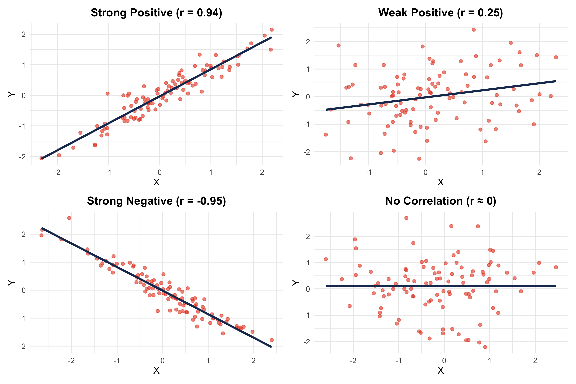
Scatter plots show correlation visually:
- Positive r: Points slope upward (↗)
- Negative r: Points slope downward (↘)
- r near 0: No clear pattern
- Strong r: Points tightly clustered around line
- Weak r: Points widely scattered
Live JASP Demo
Example 1: Independent Samples t-test
Research question: Do White and Black respondents differ in education levels?
Dataset: gss2014_education_race.csv
Steps in JASP:
- T-Tests → Independent Samples T-Test
- Dependent Variable:
EDUC - Grouping Variable:
Race - Check: Descriptives, Effect size (Cohen’s d)
- Plots → Descriptive plots
- Interpret:
- Group means (White ≈ 14.0 years, Black ≈ 13.0 years)
- t-statistic and p-value (significant?)
- Cohen’s d (effect size)
Live JASP Demo
Example 2: Chi-Square Test
Research question: Is party affiliation related to union membership?
Dataset: gss2014_education_race.csv
Steps in JASP:
- Frequencies → Contingency Tables
- Rows:
Party_Label - Columns:
Union_Label - Statistics: χ² test
- Cells: Observed counts, Expected counts, Row percentages
- Interpret:
- Cross-tabulation patterns
- χ² statistic and p-value
- Are Democrats more likely to be union members?
Live JASP Demo
Example 3: Correlation
Research question: Is unemployment rate correlated with support for government assistance?
Dataset: govt_assistance.csv
Steps in JASP:
- Regression → Correlation Matrix
- Variables:
GovtAsstandUnempl - Check: Pearson’s r, Display pairwise and report significance (show p-values)
- Plots → Correlation plots (scatter plots)
- Interpret:
- Correlation coefficient r (≈ 0.389)
- Direction (positive)
- Statistical significance (p < 0.082, not significant)
- Strength (weak correlation)
Hands-On Activity
Your Hypothesis Test
Dataset: V-Dem-v16-12variables.csv (refer to codebook)
Choose ONE exercise:
- Option A - T-Test: Presidential vs. parliamentary systems on democracy (v2x_polyarchy ~ v2exhoshog)
- Option B - Correlation: Internet censorship & freedom of expression (v2mecenefi & v2clacfree)
- Option C - ANOVA: Women’s empowerment by region (v2x_gender ~ e_regionpol_6C)
Interpret: p-value, effect size, substantive meaning
15:00
Regression Analysis
What is Regression?
Goal: Model the relationship between variables
- Dependent variable (Y): Outcome we want to explain/predict
- Independent variable (X): Predictor
- Regression line: “Best fit” line through scatter plot
- Equation: Y = a + bX + error
The Regression Equation
Y = a + bX + \epsilon
- a (intercept): Predicted Y when X = 0
- b (slope): Change in Y for one-unit increase in X
- This is the key coefficient!
- ε (error): Random variation not explained by X
Interpreting the Slope
Example: Unemployment (X) predicting support for government assistance (Y)
\text{Support} = 35.6 + 1.04 \times \text{Unemployment}
- Slope = 1.04
- For every 1 percentage point increase in unemployment…
- Support for assistance increases by 1.04 percentage points on average
Tip
Always state: “For a one-unit increase in X, Y changes by ___ units”
Interpreting the Intercept
Same example:
\text{Support} = 35.6 + 1.04 \times \text{Unemployment}
- Intercept = 35.6
- When unemployment = 0%, predicted support = 35.6%
- Often not substantively meaningful
- May be outside observed data range
Statistical Significance in Regression
Is the slope significantly different from zero?
- Null hypothesis: β = 0 (no relationship)
- t-statistic: How many SEs is slope from zero?
- p-value: Probability of slope this large if β = 0
- Confidence interval: Range of plausible values for β
If p < 0.05: Slope is significantly different from zero
R²: Variance Explained
R² = Proportion of variance in Y explained by X
- Range: 0 to 1 (often expressed as %)
- R² = 0.25: X explains 25% of variance in Y
- R² = 0.60: X explains 60% of variance in Y
- Remaining variance = unexplained/error
Note
In bivariate regression: R² = r²
Visualizing Regression
Scatter plot with regression line:
- Each point = one observation
- Line = predicted values (ŷ)
- Residuals: Vertical distance from points to line
- Good fit: Points cluster near line
- Poor fit: Points widely scattered
Regression Assumptions
For valid inference, we assume:
- Linearity: Relationship is linear (straight line)
- Independence: Observations are independent
- Homoscedasticity: Constant variance of errors
- Normality: Errors are normally distributed
Check with: Residual plots in JASP
Causation vs. Prediction
Remember
Regression shows covariation (hurdle 3), not causation!
For causal inference, still need:
- Hurdle 1: Credible mechanism
- Hurdle 2: Rule out reverse causation
- Hurdle 4: Control for confounders
- Need multiple regression (Chapter 11)
Live JASP Demo /1
Example: Simple Linear Regression
Research question: Does unemployment rate predict support for government assistance?
Dataset: govt_assistance.csv
Steps in JASP:
- Regression → Classical → Linear Regression
- Dependent Variable:
GovtAsst - Covariates:
Unempl - Statistics: Estimates, Model fit, Descriptives
- Plots: Residuals vs. predicted, Q-Q plot
- Additional: Regression line plot
Live JASP Demo /2
Interpret:
- Intercept (≈ 11): Predicted support when unemployment = 0%
- Slope (≈ 1.035): For each 1% increase in unemployment, support increases by 1.035%
- p-value: Is slope significantly different from zero?
- R² (≈ 0.151): Unemployment explains ≈15% of variance in support
- Assumptions: Check residual plots for linearity and homoscedasticity
Hands-On Activity
Your Regression Analysis
15:00
Dataset: V-Dem-v16-12variables.csv (refer to codebook)
Research Question: What does predict democratic quality?
- DV: v2x_polyarchy (Electoral democracy index)
- IV: ???
Tasks:
- Identify a variable that could explain and predict democratic quality
- Run regression in JASP
- Interpret slope, R², p-value
- Critical reflection on causal hurdles:
- Mechanism? Reverse causation? Confounders?
20:00
Integration & Application
Connecting Statistics to Causality
Statistical tests help us with Hurdle 3:
What We Can Test
- Is there covariation?
- Is it statistically significant?
- How strong is the relationship?
- What’s the direction?
What Remains
- Mechanism (Hurdle 1)
- Reverse causation (Hurdle 2)
- Confounders (Hurdle 4)
- Need multivariate methods!
The Analysis Progression
Building up complexity:
- Descriptive: Understand individual variables (today)
- Bivariate: Test relationships between two variables (today)
- Multivariate: Control for confounders (Chapter 11+)
- Advanced: Mediation, moderation, causality (later courses)
Today: Steps 1 & 2
Practical Research Workflow
Recommended order:
- Describe all variables (Chapter 7)
- Visualize relationships (scatter plots, box plots)
- Test bivariate relationships (Chapters 9-10)
- Control for confounders with multiple regression (Chapter 11)
- Check assumptions (residual plots, etc.)
- Interpret in context of causal hurdles
Common Pitfalls to Avoid
Watch Out For
- Confusing significance with importance
- Small p-value ≠ large effect
- Claiming causation from correlation
- Regression doesn’t prove causation!
- Ignoring assumptions
- Check residual plots
- Over-interpreting R²
- Low R² doesn’t mean no relationship
- High R² doesn’t mean causation
Thinking About Your Research
Apply today’s concepts:
- What research question interests you?
- What variables would you need?
- What descriptive statistics would you report?
- What hypothesis tests would be appropriate?
- What confounders would you need to control for?
- Can you establish causation or just correlation?
Wrap-Up
What We Covered Today
- Descriptive statistics: Central tendency, dispersion, visualization
- Probability & inference: Samples, populations, confidence intervals
- Hypothesis testing: p-values, significance, t-tests, chi-square, correlation
- Regression: Modeling relationships, slopes, R²
- JASP skills: Running analyses, interpreting output
Key Takeaways
Remember
- Always describe before testing
- P-values ≠ effect sizes ≠ importance
- Correlation ≠ causation (need all four hurdles!)
- Visualization is essential
- Statistics are tools for answering research questions
Connecting Both Weeks
Week 03: Foundations
- Four causal hurdles
- Research designs
- Survey methods
- Measurement
- JASP basics
Week 04: Analysis
- Descriptive statistics
- Inference
- Hypothesis testing
- Regression
- JASP applications
Together: A complete research toolkit!
Moving Forward
Next steps in your research journey:
- Practice these skills with different datasets
- Think causally - always consider the four hurdles
- Read critically - evaluate claims in published research
- Apply to your projects - what analyses do you need?
- Learn more: Multiple regression, advanced methods
Resources for Continued Learning
- Textbook: Kellstedt et al. (2022, chaps. 7–10)
- JASP: jasp-stats.org
- Tutorials and documentation
- Example datasets
- Practice: Work through examples on your own
- Ask questions: Office hours, discussion forums
Final Thoughts
Statistics in context:
- Numbers tell a story about the social world
- Methods are tools to answer meaningful questions
- Always connect back to theory and causality
- Be skeptical - even of your own results!
- Replicate and validate findings
The Goal
Not to become statisticians, but to be informed researchers who can:
- Design good studies
- Analyze data appropriately
- Interpret results critically
- Communicate findings clearly
Questions & Discussion
Open discussion:
- What concepts remain unclear?
- How do these methods apply to your research?
- What additional examples would be helpful?
- What challenges do you foresee in your own projects?
Think-pair-share: Discuss with your neighbor, then share with class
Thanks!
References
Kellstedt, Paul M., Guy D. Whitten, and Steven A. Tuch. 2022. The Fundamentals of Social Research. Cambridge University Press. https://doi.org/10.1017/9781316415399.