Week 03: Quantitative Analysis I & II
Causality, Research Design, Survey Methods, and Measurement
SSPS4403 Research Methods
The University of Sydney
Semester 2, 2026
Welcome
Acknowledgement of Country
I would like to acknowledge the Traditional Owners of Australia and recognise their continuing connection to land, water and culture. The University of Sydney is located on the land of the Gadigal people of the Eora Nation. I pay my respects to their Elders, past and present.
Required Reading
Textbook: Kellstedt, Whitten, and Tuch (2022)
This week’s chapters:
- Chapter 3: Evaluating Causal Relationships
- Chapter 4: Research Design
- Chapter 5: Survey Research
- Chapter 6: Measuring Concepts of Interest
Today’s Journey
Chapters 3-6: Building Research Foundations
- Understanding causality and the four causal hurdles
- Research design strategies
- Survey research methods
- Measurement concepts
- Introduction to JASP
Learning Objectives
By the end of today, you will be able to:
- Apply the four causal hurdles to evaluate research claims
- Distinguish between different research designs
- Understand survey methodology fundamentals
- Evaluate measurement validity and reliability
- Explore data structure in JASP
Causality
Why Causality Matters
Modern sociology fundamentally revolves around establishing whether there are causal relationships between important concepts.
— Kellstedt, Whitten, and Tuch (2022, chap. 3)
Remember
Finding a relationship ≠ Finding a causal relationship
Probabilistic vs. Deterministic
In social science:
- Relationships are probabilistic, not deterministic
- We can’t predict individual behavior with certainty
- Example: Wealth → Tax preferences
- Not: “All wealthy people want lower taxes”
- But: “Wealthy people are more likely to prefer lower taxes”
The Four Causal Hurdles
To claim X causes Y, we must cross four hurdles:
- Is there a credible causal mechanism connecting X to Y?
- Can we eliminate reverse causation (Y causing X)?
- Is there covariation between X and Y?
- Have we controlled for confounders (Z variables)?
Hurdle 1: Causal Mechanism
Question: How and why would X cause Y?
Think Through the Process
- What is the logical connection?
- What are the intermediate steps?
- Is the mechanism plausible?
Example: School choice → Test scores
- Mechanism: Private schools → Smaller classes → More attention → Better learning → Higher scores
Hurdle 2: Reverse Causation
Question: Could Y cause X instead?
Sometimes easy to rule out:
- Gender → Abortion attitudes ✓
- Attitudes can’t cause gender
Sometimes difficult:
- Intergroup contact ⟷ Racial tolerance
- Contact may increase tolerance
- OR tolerant people may seek contact
- OR both!
Hurdle 3: Covariation
Question: Do X and Y vary together?
- Generally necessary for causation
- “More X → More Y” or “More X → Less Y”
- BUT: Correlation ≠ Causation!
Important Caveat
No bivariate relationship? Don’t give up yet! A confounding variable Z might be suppressing the relationship.
Hurdle 4: Confounding Variables
Question: Have we controlled for other causes of Y?
The Problem
- Most outcomes have multiple causes
- If Z causes both X and Y…
- The X-Y relationship might be spurious
Example: School Choice
- X: School type
- Y: Test scores
- Z: Parental involvement
- Affects school choice
- Affects test scores
The Causal Hurdles Scorecard
Track answers with: [hurdle1 hurdle2 hurdle3 hurdle4]
- y = yes, n = no, m = maybe
- [y y y y] = Strong causal claim ✓
- [n ? ? ?] = Stop and reformulate
- [y n y y] = Reasonable evidence (reverse causation unclear)
- [y y y n] = Suspicious! Need to control for confounders
In-class Task
Causal Claims Exercise
In groups, evaluate these claims using the scorecard:
- “School choice programs improve student test scores”
- “Red wine consumption reduces heart disease”
- “Social media use causes depression”
For each claim:
- Assess all four hurdles [y/n/m y/n/m y/n/m y/n/m]
- Identify the strongest and weakest hurdles
- What additional evidence would strengthen the claim?
The four hurdles:
- Is there a credible causal mechanism connecting X to Y?
- Can we eliminate reverse causation (Y causing X)?
- Is there covariation between X and Y?
- Have we controlled for confounders (Z variables)?
Research Design
Why Research Design Matters
Good research design helps us:
- Cross the four causal hurdles more effectively
- Control for confounders (hurdle 4)
- Rule out reverse causation (hurdle 2)
- Make stronger inferences about causality
Important
Bad design → Bad statistics (no matter how sophisticated!)
Types of Research Designs
Experimental
- Random assignment
- Researcher controls treatment
- Gold standard for causality
Observational
- No random assignment
- Observe natural variation
- More common in social science
Experimental Designs
Key features:
- Random assignment to treatment/control groups
- Randomization ensures groups are equivalent
- Rules out confounders (on average)
- Can establish causation with confidence
Example: Testing teaching methods
- Randomly assign students to new vs. old method
- Compare outcomes
- Differences → Caused by method
Observational Designs
Challenges:
- Groups differ in many ways
- Cannot randomly assign many social factors
- Gender, race, education history, neighborhood, etc.
- Must control for confounders statistically
- Causation is harder to establish
Example: Effect of poverty on crime
- Can’t randomly assign poverty!
- Must account for other differences between poor/non-poor neighborhoods
Quasi-Experimental Designs
Middle ground:
- Not truly experimental (no random assignment)
- BUT: Leverage natural experiments
- Policy changes, cutoff dates, geographic boundaries
Example: Voting law changes
- Some states change laws, others don’t
- Compare turnout before/after
- Compare across states
Design → Causal Hurdles
| Design | Mechanism | Reverse | Covariation | Confounders |
|---|---|---|---|---|
| Experimental | Test | ✓✓✓ | Test | ✓✓✓ |
| Quasi-exp. | Test | ✓✓ | Test | ✓✓ |
| Observational | Test | ✓ | Test | ✓ |
Better design → More hurdles cleared
Group Activity
Design Matching
In groups of 3-4:
For each research scenario, identify:
- The most appropriate research design
- Why it’s suitable
- Which causal hurdles it helps address
- Remaining challenges
Scenarios on handout
Survey Research
Why Surveys?
Surveys are a primary tool for:
- Measuring attitudes and opinions
- Understanding behaviors and experiences
- Collecting data from large populations
- Enabling generalization
But: Survey design matters!
Sampling: The Big Challenge
The Goal:
- Learn about a population (all Australian adults)
- By studying a sample (1,000 survey respondents)
Key Question
Is your sample representative of the population?
Types of Sampling
Random Sampling
- Every population member has known probability of selection
- Allows generalization
- Examples: Simple random, stratified, cluster
Non-Random Sampling
- Convenience, snowball, quota
- Cannot generalize with confidence
- May introduce bias
Survey Design Considerations
- Question wording
- Clear, unambiguous language
- Avoid leading questions
- Avoid double-barreled questions
- Response options
- Exhaustive and mutually exclusive
- Appropriate scale
- Question order
- Priming effects matter
Common Survey Challenges
- Non-response bias: Who doesn’t respond?
- Social desirability bias: Respondents give “acceptable” answers
- Recall problems: Memory limitations
- Mode effects: Phone vs. online vs. in-person
Tip
Always consider: What biases might affect these survey results?
Measurement
From Concepts to Data
The measurement process:
Concept (abstract idea)
↓
Operationalisation (how to measure)
↓
Variable (actual data)
Example: Measuring “Racism”
- Concept: Racism (abstract)
- Operationalisation choices:
- Attitudes toward racial groups?
- Support for discriminatory policies?
- Implicit association test?
- Behavioural measures?
- Variable: Survey responses, test scores, etc.
Each choice has implications!
Key Measurement Concepts
Two fundamental properties of good measurement:
- Validity - Accuracy
- Reliability - Consistency
Validity: Measuring What You Intend
Central question: Does this measure actually capture the concept I care about?
The Core Issue
A measure can be reliable but not valid!
Example: Measuring “intelligence” by shoe size - Very reliable (shoe size doesn’t change much) - Not valid (shoe size isn’t intelligence)
Types of Validity
Face Validity
- Definition: Does it look like it measures what it claims?
- Example (Valid): Asking “How happy are you?” to measure happiness
- Example (Invalid): Asking “What’s your favorite color?” to measure happiness
- Limitation: Subjective judgment, not rigorous
Content Validity
- Definition: Does it cover all aspects of the concept?
- Example: Testing math skills
- ✓ Valid: Questions on algebra, geometry, statistics
- ✗ Invalid: Only algebra questions
- Method: Expert review of content coverage
Types of Validity (continued)
Construct Validity
- Definition: Does it relate to other variables as theory predicts?
- Example: Depression measure should:
- Correlate with anxiety (related concept)
- Predict absenteeism (behavioral outcome)
- Differ between clinical and non-clinical groups
- Gold standard for validity
Criterion Validity
- Definition: Does it predict relevant outcomes?
- Example: SAT scores
- Should predict college GPA
- Concurrent: Correlates with current grades
- Predictive: Forecasts future performance
Validity Example: Measuring “Political Knowledge”
Concept: How much do people know about politics?
- Low Face Validity: “Do you follow the news?” (could say yes but not retain info)
- Better Content Validity: Multiple questions covering:
- Institutions (Who is the Prime Minister?)
- Current events (What party controls Parliament?)
- Policy (What does Medicare cover?)
- Construct Validity Check:
- Should correlate with education level ✓
- Should predict voter turnout ✓
- Should be higher among political science majors ✓
Reliability: Measuring Consistently
Central question: Would we get the same result if we measured again?
Key Principle
Without reliability, we can’t have validity!
If a thermometer gives random readings, it can’t accurately measure temperature.
Types of Reliability
Test-Retest Reliability
Definition: Do you get the same score if you measure the same person twice?
- Example: Personality test
- Take test on Monday → Score 75
- Take same test on Friday → Score 74
- High correlation = good reliability
- Challenge: Some concepts genuinely change (mood, opinions)
- Application: Use for stable traits (personality, intelligence)
Types of Reliability (continued)
Inter-Rater Reliability
Definition: Do different observers/coders give the same score?
- Example: Coding tweets as “positive” or “negative”
- Coder A: 120 positive, 80 negative
- Coder B: 118 positive, 82 negative
- Agreement = good reliability
- Measurement: Cohen’s kappa, percent agreement
- Critical for: Content analysis, behavioral observation, essay grading
Types of Reliability (continued)
Internal Consistency
Definition: Do multiple items measuring the same concept give similar results?
- Example: Depression scale with 10 questions
- If truly measuring depression, all items should correlate
- Person scoring high on “I feel sad” should also score high on “I feel hopeless”
- Measurement: Cronbach’s alpha (α > 0.70 is good)
- Application: Multi-item scales and surveys
Reliability Example: Measuring “Life Satisfaction”
Single Item: “How satisfied are you with your life?” (1-10 scale)
- Test-retest: Ask same person 2 weeks apart
- Good reliability: Scores within 1 point
- Poor reliability: Monday=8, Friday=3
Multiple Items: Life Satisfaction Scale
- “In most ways my life is close to my ideal”
- “The conditions of my life are excellent”
- “I am satisfied with my life”
- “So far I have gotten the important things I want in life”
- “If I could live my life over, I would change almost nothing”
All items should correlate (internal consistency)
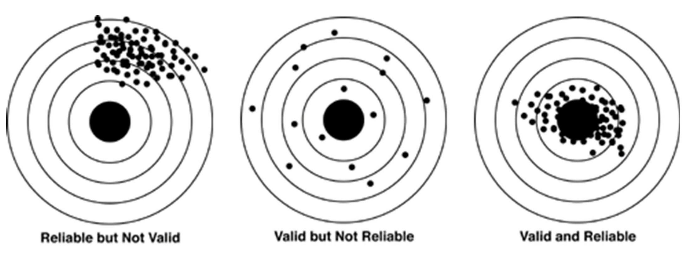
The Validity-Reliability Relationship
Four possible scenarios:
| Reliable | Unreliable | |
|---|---|---|
| Valid | ✓✓ IDEAL Accurate & consistent |
✗ Problematic Can’t be valid without reliability |
| Invalid | ✗ Precise but wrong (like a biased scale) |
✗✗ WORST Random noise |
Tip
Think of a dartboard: - Valid & Reliable: Darts clustered around bullseye - Reliable but Invalid: Darts clustered, but in wrong spot - Unreliable: Darts scattered everywhere
Practical Implications
When developing measures, ask:
- Face validity: Does this seem reasonable?
- Content validity: Am I covering all aspects of the concept?
- Construct validity: Does it relate to other variables as expected?
- Test-retest: Are scores stable over time (if concept is stable)?
- Inter-rater: Do different coders agree (if coding required)?
- Internal consistency: Do multiple items correlate (if using scale)?
Good measurement is the foundation of good research!
Variable Types
Three measurement levels:
Categorical
- Qualitatively different
- No inherent order
- Example: Religion
Ordinal
- Can rank order
- Unequal intervals
- Example: Satisfaction (high/med/low)
Continuous
- Equal unit differences
- Mathematical operations meaningful
- Example: Age, income
Variable Types Matter!
Why care about measurement level?
- Determines appropriate statistics
- Affects interpretation
- Informs analysis choices
In JASP
You’ll need to specify: Nominal, Ordinal, or Scale
Getting Started with JASP
JASP Interface Overview
What You See When You Start JASP
Left Side
- Top Menu Bar
- File, Edit, Data tabs
- Analysis buttons (Descriptives, T-Tests, Regression, etc.)
- Data View
- Spreadsheet with rows (cases) and columns (variables)
- Each row = one participant/observation
- Each column = one variable
Right Side
- Results Panel
- Analysis output appears here
- Updates in real-time
- Can copy/export results
- Analysis Options Panel (center-left when analysis selected)
- Choose variables
- Select options
- Customize analysis
Loading Data into JASP
Two Main Ways to Get Data
Method 1: Open CSV Files (Most Common)
- Click File → Open
- Select Computer → Browse
- Navigate to your
.csvfile (you can also open Excel files) - Click Open
CSV File Format: - Plain text file - Comma-separated values - Can be created in Excel, Google Sheets, etc. - First row = variable names
Method 2: Open .jasp Files
- Contains both data AND previous analyses
- Click File → Open → Select
.jaspfile - (This is also the format to save your JASP workspace)
First Dataset: titanic.csv
Understanding Variable Types
Three Variable Types in JASP
JASP uses symbols in column headers to show variable type:
| Type | Description | Example |
|---|---|---|
| Scale | Continuous numerical data | Age, Height, Income |
| Ordinal | Ordered categories | Education level (1=Low, 2=Medium, 3=High) |
| Nominal | Unordered categories | Gender, Color, Country |
IMPORTANT
- JASP guesses variable types when loading data
- It may guess wrong!
- You must check and fix variable types
- Wrong variable type → Wrong analysis options → Wrong results!
Changing Variable Types
Two Methods:
Method 1: Click the Icon
- Click the symbol in the column header
- Select the correct type from dropdown
- Done!
Method 2: Use the Variable Editor
- Double-click the column header
- Change measurement level
- Can also add labels here
Important Tips:
- IDs should be Nominal (even if numbers)
- Likert scales can be Ordinal or Scale (your choice)
- Binary variables (0/1) should be Nominal
- Age is Scale (continuous numbers)
Hands-On: Loading the Titanic Dataset
Your Task:
- Download the file
titanic.csvfrom Canvas - Open JASP on your computer
- Load the data:
- File → Open → Computer → Browse
- Find
titanic.csvand open it
- Examine the data:
- How many rows (passengers)?
- How many columns (variables)?
- What variables do you see?
Expected: 891 rows, 12 columns
Hands-On: Identifying & Fixing Variable Types
The Titanic Dataset Variables:
Look at your data and identify which type each variable should be:
| Variable | Current Type? | Should Be? |
|---|---|---|
| PassengerId | ? | ? |
| Survived | ? | ? |
| Pclass | ? | ? |
| Name | ? | ? |
| Sex | ? | ? |
| Age | ? | ? |
| Fare | ? | ? |
Your Task:
- Check what type JASP assigned to each variable
- Decide what type each should be
- Fix any incorrect types by clicking the icon
Solution: Correct Variable Types for Titanic
| Variable | Should Be | Why? |
|---|---|---|
| PassengerId | Nominal | ID number (not meaningful numerically) |
| Survived | Nominal | Binary: 0 = No, 1 = Yes |
| Pclass | Nominal or Ordinal | Ticket class: 1, 2, 3 (categories) |
| Name | Nominal | Text label (categorical) |
| Sex | Nominal | male or female (categorical) |
| Age | Scale | Continuous number (0-80 years) |
| Fare | Scale | Continuous number (price paid) |
Key Decisions:
- Survived: Could be ordinal, but typically treated as nominal for chi-square tests
- Pclass: Could be ordinal (ordered categories) or nominal—both work!
Adding Value Labels in JASP
Making Your Data More Readable
Why Add Labels?
- Numeric codes (0, 1) are hard to interpret
- Labels make output easier to read
- Essential for clear reporting and presentations
Example: Survived Variable
- Current: 0 and 1 (confusing!)
- Better: “Did not survive” and “Survived” (clear!)
When to Use Labels
- Binary variables (Yes/No, Male/Female)
- Categorical codes (1=Low, 2=Medium, 3=High)
- Any nominal variable with numeric codes
Hands-On: Adding Labels to Survived
Make the Survived Variable More Interpretable
Step-by-Step Instructions:
- Open the Variable Editor (Edit Data):
- Double-click on the Survived column header
- OR right-click the column → Edit column
- Add Value Labels:
- In the variable editor window, find the Labels section
- Click + Add label
- For value 0, enter label: “Did not survive”
- Click + Add label again
- For value 1, enter label: “Survived”
- Apply and Check:
- Click outside the editor or press Enter
- Run a frequency table: Descriptives → Descriptive Statistics
- Move Survived to Variables
- Check Frequency tables
- Observe the Difference:
- Your frequency table now shows meaningful labels!
- Instead of “0” and “1”, you see “Did not survive” and “Survived”
Descriptive Statistics
What Are Descriptive Statistics?
Summarizing Your Data
For Continuous Variables (Scale)
Central tendency: Where is the “middle”? - Mean, Median, Mode
Spread: How spread out are the values? - Standard deviation, Variance, Range - Minimum, Maximum, Quartiles
For Categorical Variables (Nominal/Ordinal)
Frequencies: How many in each category? - Counts and percentages
Why Use Them? - Understand your data before analysis - Spot errors and outliers - Describe your sample in reports
Measures of Central Tendency
Finding the “Middle” of Your Data
Mean (Average)
- Sum of all values ÷ number of values
- Most commonly used
- Sensitive to outliers
- Example: Ages = 20, 25, 30, 35, 100 → Mean = 42
Median
- Middle value when data is sorted
- Robust to outliers
- Example: Ages = 20, 25, 30, 35, 100 → Median = 30
Mode
- Most frequently occurring value
- Can be used for any variable type
- Example: Ages = 20, 25, 25, 25, 30 → Mode = 25
Which to use?
- Normally distributed data → Mean
- Skewed data or outliers → Median
- Categorical data → Mode
Measures of Spread
How Variable Is Your Data?
1. Standard Deviation (SD)
- Average distance from the mean
- Most commonly reported
- Same units as your data
- Larger SD = more spread out
2. Variance
- Squared standard deviation
- Less intuitive but used in calculations
3. Range
- Maximum - Minimum
- Shows full spread
4. Interquartile Range (IQR)
- Range of middle 50% of data
- 75th percentile - 25th percentile
- Robust to outliers
Computing Descriptives in JASP
Step-by-Step Guide
Steps
- Open the Analysis Menu:
- Click Descriptives button (top menu bar)
- Select Descriptive Statistics
- Select Variables:
- Drag variables from left box to Variables box
- OR click variable and use arrow button
Choose Statistics
- Choose Statistics:
- Under Statistics, check boxes for what you want:
- ☑ Mean
- ☑ Median
- ☑ Std. Deviation
- ☑ Minimum / Maximum
- etc.
- View Results:
- Results appear immediately in right panel
- Update in real-time as you change options
Hands-On: Descriptive Statistics for Age
Your Task:
Calculate descriptive statistics for the Age variable:
Steps
- Go to: Descriptives → Descriptive Statistics
- Move Age to the Variables box
- Under Statistics, select:
- ☑ Mean
- ☑ Median
- ☑ Std. Deviation
- ☑ Minimum
- ☑ Maximum
- ☑ Range
Questions to Answer
- What is the average age of Titanic passengers?
- What is the median age?
- What is the youngest age? Oldest?
- Is the mean or median higher? What does this tell us?
Interpreting Age Statistics
Expected Results (approximately):
| Statistic | Value | Interpretation |
|---|---|---|
| Mean | ~29.7 | Average age around 30 years |
| Median | ~28.0 | Middle age is 28 |
| SD | ~14.5 | Typical deviation is ±14-15 years |
| Min | ~0.42 | Youngest passenger was an infant |
| Max | ~80 | Oldest was 80 years old |
| Range | ~80 | Ages span 80 years |
Observations:
- Mean > Median → Slight positive skew (right tail)
- Some older passengers pull the mean up
- Large SD indicates substantial age variation
- Note: Some ages are missing (Missing = 177)
Frequency Tables for Categorical Data
Counting Categories
For Nominal/Ordinal Variables
Frequency tables show:
- Count in each category
- Percentage in each category
- Cumulative percentages (for ordinal)
How to Create in JASP
- Descriptives → Descriptive Statistics
- Move categorical variable to Variables box
- Under Tables, check:
- ☑ Frequency tables
Result
- Table showing counts and percentages
- Helps understand distribution of categories
Hands-On: Frequency Tables
Part A: Survival Status
- Create a frequency table for Survived
- Answer:
- How many passengers survived?
- How many died?
- What percentage survived?
Part B: Sex Distribution
- Create a frequency table for Sex
- Answer:
- How many males vs females?
- What percentage were male?
Part C: Passenger Class
- Create a frequency table for Pclass
- Answer:
- Which class had the most passengers?
- What’s the distribution across classes?
Expected Results: Frequency Tables
Survived
| Value | Count | Percent |
|---|---|---|
| 0 (No) | 549 | 61.6% |
| 1 (Yes) | 342 | 38.4% |
Sex
| Value | Count | Percent |
|---|---|---|
| male | 577 | 64.8% |
| female | 314 | 35.2% |
Pclass
| Value | Count | Percent |
|---|---|---|
| 1 (First) | 216 | 24.2% |
| 2 (Second) | 184 | 20.7% |
| 3 (Third) | 491 | 55.1% |
Insights:
- Most passengers died (61.6%)
- More males than females (about 2:1)
- Most passengers were in 3rd class (55%)
Hands-On: Split Frequency Tables
Understanding Survival Patterns Across Groups
The Question: Did survival rates differ by passenger class? By sex?
Part A: Survival by Passenger Class
- Go to: Descriptives → Descriptive Statistics
- Move Survived to the Variables box
- Move Pclass to the Split box
- Under Statistics, check: ☑ Frequency tables
What You See:
- Separate frequency tables for each class (1st, 2nd, 3rd)
- Survival counts and percentages within each class
Observe:
- Which class had the highest survival rate?
- Which class had the lowest?
- What pattern do you notice?
Hands-On: Part B - Survival by Sex
Now You Try:
Using the same approach:
- Keep Survived in the Variables box
- Replace Pclass with Sex in the Split box
- Keep Frequency tables checked
Questions to Answer:
- What percentage of males survived?
- What percentage of females survived?
- Is there a notable difference?
- What might explain this pattern?
Note
Discuss: What story do these two analyses tell us about survival on the Titanic?
Drawing Plots with JASP
Visualizing Distributions
Adding Plots to Descriptives
For Scale Variables
Under Basic Plots/Customizable Plots in Descriptive Statistics:
- ☑ Distribution plots → Histogram
- ☑ Display density → Smooth curve overlay
- ☑ Boxplots → Shows median, quartiles, outliers
Benefits
- Histograms: See shape of distribution
- Density plots: Smooth distribution curve
- Boxplots: Quick summary with outliers
For Categorical Variables
- Frequency tables are often sufficient
- Bar charts can be created elsewhere in JASP
Hands-On: Visualizing Age Distribution
Your Task:
Create visualizations for the Age variable:
Steps
- Keep Age in the Variables box
- Under Plots, check:
- ☑ Distribution plots
- ☑ Display density
- ☑ Boxplots
Observe and Discuss
- What shape is the distribution?
- Is it symmetric or skewed?
- Where is the peak?
- Are there any outliers?
- What does the boxplot tell you about the median and quartiles?
Reading a Boxplot
Understanding Box-and-Whisker Plots
Anatomy of a Boxplot
    ●  ← Outlier (beyond 1.5 × IQR)
    |
    ┬  ← Maximum (within 1.5 × IQR)
    |
    ┼──┐
    │  │
    │──│ ← Median (thick line)
    │  │
    └──┼
    |
    ┴  ← Minimum (within 1.5 × IQR)
    |
    ●  ← Outlier
Interpretation
- Box: Contains middle 50% of data (25th to 75th percentile)
- Whiskers: Extend to most extreme non-outlier values
- Dots: Outliers beyond 1.5 × IQR
Quick Assessment: - Symmetric box → Symmetric distribution - Long upper whisker → Right skew - Dots → Potential outliers to investigate
Grouped Descriptive Statistics
Comparing Groups
What if we want to compare subgroups?
Example: Age statistics separately for males and females
How to Do It
- Descriptives → Descriptive Statistics
- Move continuous variable (Age) to Variables
- Move grouping variable (Pclass) to Split box
- Select desired statistics
Result: - Separate statistics for each group - Easy comparison across groups - Can also split plots!
This is useful for
- Comparing survivors vs non-survivors
- Comparing passenger classes
- Any categorical breakdown
Hands-On: Comparing Age by Survival Status
Your Task:
Compare age distributions for survivors vs non-survivors:
Steps
- Descriptives → Descriptive Statistics
- Move Age to Variables
- Move Survived to Split
- Check: Mean, Median, SD, Min, Max
- Under Plots, check Boxplots
Questions
- Were survivors younger or older on average?
- Is there a difference in median age?
- Do the boxplots show different patterns?
- What does this suggest?
Discussion: Age by Survival Status
Expected Pattern:
| Survived | Mean Age | Median Age | Observations |
|---|---|---|---|
| 0 (Died) | ~30.6 | 28 | Slightly older |
| 1 (Survived) | ~28.3 | 28 | Slightly younger |
Insights
- Small difference in mean age
- Similar median ages
- Children may have had better survival rates
- But age alone doesn’t tell the whole story!
Next Steps
- These are just descriptive statistics
- To test if differences are significant, we need:
- Chi-square test (for categorical comparisons)
- t-test (for mean comparisons)
- More complex analyses
This is where hypothesis testing comes in!
Hands-On: Complete Descriptive Analysis
Your Challenge:
Perform a complete descriptive analysis of Fare:
Part 1
- Calculate descriptive statistics:
- Central tendency (Mean, Median)
- Spread (SD, Range, IQR)
- Check for missing values
- Create visualizations:
- Histogram with density
- Boxplot
Part 2
- Compare across passenger classes:
- Split by Pclass
- Compare mean fares
- Interpret:
- What is the typical fare?
- How variable are the fares?
- Do fares differ by class?
Creating Computed Variables
Transforming Data in JASP
What are Computed Variables?
- New variables created by performing calculations on existing variables
- Useful for: transformations, sum scores, z-scores, differences, ratios
Common Uses: - Log transformations → Normalize skewed data - Z-scores → Standardize variables - Sum scores → Combine multiple items - Difference scores → Change from baseline - Means → Average across variables
How to Create
- Click the “+” button in the column header row
- Name your new variable
- Select “Computed type” → “Computed with drag-and-drop”
- Enter your formula
- Click “Compute column”
Hands-On: Creating Computed Variables
Let’s create two new variables together
First variable:
FARE + 1Then use this new variable to create:
log(FARE + 1)
What’s the point of taking the log of FARE + 1?
This is necessary because some passengers paid 0 as FARE. And \log(0) = -\infty.
Of course, -\infty would be impossible to visualize.
Adding 1 to variables that contain zeros is a common, quick-and-dirty trick to still return meaningful visualizations.
Understanding the Log Transformation
What Did We Just Do?
The Formula: log(Fare+1) - Takes the natural logarithm (base e) of each Fare+1 value - Compresses large values more than small values - Result: more symmetric distribution
Example Transformations:
| Original Fare | log(Fare+1) | Interpretation |
|---|---|---|
| £1 | 0.00 | Log of 1 is 0 |
| £10 | 2.30 | |
| £100 | 4.61 | Less difference at high end |
| £500 | 6.21 |
Notice: The gap between £1 and £100 is huge in original scale, but only 4.61 units in log scale. Meanwhile, £100 to £500 (5x increase) is only 1.6 log units.
Hands-On: Compare Original vs Log-Transformed Fare
Now let’s see the difference:
Steps
- Create histograms for both:
- Descriptives → Descriptive Statistics
- Move both FARE AND log(FARE + 1) to Variables
- Under Basic Plots, check:
- ☑ Distribution plots
- ☑ Display density
- Under Customizable Plots, check:
- ☑ Boxplot
- Calculate descriptives for both:
- Check: Mean, Median, SD, Min, Max, Skewness
Questions to Answer
- Which distribution looks more normal?
- How did the skewness change?
- Which measure (mean or median) is more similar after transformation?
- What happened to the outliers?
Exporting Your Results
Saving Your Work
1. Copy Individual Tables/Plots
- Right-click on any result
- Select Copy or Copy Special
- Paste into Word, PowerPoint, etc.
- Tables are APA-formatted!
2. Export Data
- File → Export Data
- Save as CSV (can open in Excel)
- Useful if you’ve computed new variables
3. Save JASP File
- File → Save As
- Saves data AND all analyses
- Can reopen later and continue work
- Share with collaborators
Tip
Pro Tip: Save as .jasp file regularly to preserve your work!
Wrap-Up
What We Covered Today
- Four causal hurdles for evaluating causal claims
- Research designs and their strengths/limitations
- Survey research fundamentals and challenges
- Measurement concepts: validity, reliability, variable types
- JASP basics: interface, loading data, descriptive exploration
Connecting It All
The research process:
- Start with causal question (Ch 3)
- Choose appropriate research design (Ch 4)
- Collect data (Ch 5: surveys, etc.)
- Measure concepts carefully (Ch 6)
- Explore data before testing (Ch 7, today in JASP)
Looking Ahead: Week 04
Next week: Statistical Analysis
- Descriptive statistics in depth
- Probability and inference
- Hypothesis testing (crossing hurdle 3!)
- Bivariate relationships
- Introduction to regression
Before Next Week
Familiarise yourself with the JASP interface. Explore datasets on your own!
Questions?
Key takeaways:
- Causality requires crossing four hurdles
- Research design helps us cross those hurdles
- Measurement matters - from concept to variable
- JASP is a tool for exploring and testing our data
Preparing for your own research:
Think about your research question - which design would work? What variables would you need?
Thanks!
See you next week!
Resources:
- Kellstedt, Whitten, and Tuch (2022, chaps. 3–6)
- JASP tutorials: jasp-stats.org/how-to-use-jasp
References
Kellstedt, Paul M., Guy D. Whitten, and Steven A. Tuch. 2022. The Fundamentals of Social Research. Cambridge University Press. https://doi.org/10.1017/9781316415399.